Carnival Balloon Colours 2026: Palette Ideas
Carnival season 2026 is a great opportunity to explore bolder colour combinations, metallic accents and palettes that suit formal balls, themed parties, Polish school proms and corporate events.
As a manufacturer of
latex balloons,
we can both observe colour trends and suggest our own combinations. The combinations below are therefore our recommended colour palettes for carnival season 2026.
There is no single must-have “trending palette”. When choosing colours, consider the character of the event, lighting, venue size and background, as well as whether you want a light, airy display or something bolder with stronger contrasts.
Which colour trends do we suggest for carnival season 2026?
Our Everts-Pol palettes for carnival season 2026 focus on three main directions:- deep colours paired with metallic accents – such as burgundy with gold or navy blue with silver,
- light palettes with one shiny accent – such as blush pink, white and rose gold,
- soft pastel combinations – such as mint, light blue and white.
Palette 1: navy blue + silver + white
Navy blue, silver and white are a good choice for decorations that combine a dark base with light and metallic accents. Navy blue can be the main colour, white can brighten the arrangement, and silver can add shine. This combination can be used for:- carnival balls,
- Polish school proms,
- evening corporate events,
- photo areas,
- entrance or stage decorations.
Palette 2: burgundy + gold + white
For carnival season 2026, we suggest burgundy and gold for anyone looking for a darker palette with a distinct metallic accent. Burgundy can be the dominant colour, with gold as a complement and white to brighten a larger display. You do not need to use all three colours in equal proportions. For example:- burgundy can make up most of the garland,
- gold balloons can provide occasional accents,
- white can separate darker sections of the arrangement.
Palette 3: blush pink + rose gold + white
For a lighter display, we suggest combining blush pink, rose gold and white. Blush pink can form the pastel base, white can create neutral transitions, and rose gold can provide a shiny accent. This palette can be used for:- a balloon garland,
- table decorations,
- a photo area,
- entrance decorations,
- a smaller arrangement beside a stage or stand.
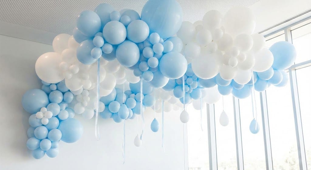
Palette 4: mint + light blue + white
Another Everts-Pol suggestion for carnival season 2026 is a light pastel palette based on mint, light blue and white. Pastel blue can be paired with mint as the second colour, while white brightens the overall arrangement. This combination works well where dark navy blue, burgundy or black would be too strong for the planned display. Mint is not being presented here as an “eco-friendly colour”. We simply treat it as a light shade of green that can be combined with other pastels.How to use chrome balloons for carnival decorations
Carnival season is a good opportunity to use chrome balloons, as their shine can be combined with both dark and pastel bases.Gold
We suggest using gold balloons primarily as an accent alongside:- burgundy,
- black,
- white,
- navy blue.
Silver
Silver can be used in cooler palettes, for example with:- navy blue,
- light blue,
- white,
- black.
Rose gold
Rose gold works particularly well with blush pink, white and other light shades. It can provide a metallic accent without the need to build the entire display from chrome balloons.How to combine contrasting colours in carnival decorations
Contrast helps distinguish different sections of a display. However, this does not mean that every arrangement needs strongly opposing colours. For carnival season 2026, we suggest combinations such as:- navy blue + white + silver,
- burgundy + white + gold,
- black + gold,
- navy blue + pastel blue,
- blush pink + white + rose gold.
How to choose balloon colours for a corporate ball
For a corporate event, the colours of your brand’s visual identity can be a useful starting point. This does not mean that the entire display must consist only of the colours in your logo. Use a brand colour as the base, then complement it with white, black or a metallic colour. For example:- brand navy blue + white + silver,
- maroon or burgundy + white + gold,
- pink + white + rose gold,
- light blue + white + silver.
How to choose latex balloons for carnival season
A colour palette is a useful starting point when choosing balloons for carnival season, but colour is not the only consideration. Also check:- the type of event – a ball, Polish school prom, corporate event or themed party,
- the location of the decorations – entrance, stage, tables or photo area,
- the background and lighting,
- the balloon sizes required,
- the type of finish – classic, pastel or chrome,
- the number of colours in one arrangement.
FAQ – frequently asked questions
Which balloon colours does Everts-Pol suggest for carnival season 2026?
For carnival season 2026, we suggest navy blue with silver and white, burgundy with gold and white, blush pink with rose gold, and a light palette of mint, light blue and white. These are colour combinations proposed by Everts-Pol as a balloon manufacturer.
How many colours should you use in carnival decorations?
There is no single required number. A palette of two or three colours works well for many displays: one can be dominant, another complementary, and a third can provide an accent.
Which colours can you combine with gold balloons for carnival season?
Gold can be combined with burgundy, black, white or navy blue. In a larger display, gold balloons can serve as accents rather than the dominant colour.
How should you choose balloon colours for a corporate ball?
The colours of your company’s visual identity are a good starting point. Combine them with neutral white, black, metallic gold or silver to create a palette suited to the character of the event.
Can a balloon’s colour look different after inflation?
Yes. Latex stretches during inflation, so the shade may appear lighter or differ in intensity from that of an uninflated balloon. Lighting and the background colour also affect how it looks.
Do carnival decorations have to use only dark and metallic colours?
No. Carnival decorations can be dark and contrasting, light or pastel. For 2026, Everts-Pol suggests both palettes featuring navy blue, burgundy and metallic accents, and combinations of blush pink, mint, light blue and white.