How to Choose Balloon Colours for Events
Key information:
- Why are latex balloons at the heart of event styling?
- How do balloon colours influence guests?
- How to match balloon colours to your brand identity
- Pastel, Crystal, Metallic and Chrome – how does the finish change the look of a display?
- Choosing colours for different events – a practical guide
- How to avoid colour mistakes at your event
- FAQ – frequently asked questions
Why are latex balloons at the heart of event styling?
Balloon colours primarily influence the appearance and cohesion of the overall arrangement. They can also evoke particular associations, but these depend on the context, surrounding colours, the character of the event and the viewer’s experiences. When choosing a palette, consider not only colour psychology but also brand identity, lighting, the background and the level of contrast required. With balloons, it also matters how a colour looks after inflation. The stretching of the latex, the type of lighting and the background colour can all affect how a shade is perceived. For important projects, assess an inflated balloon under conditions similar to those in which it will be used. For larger arrangements, you can use colour blocking: creating distinct areas or sections based on a single colour or several clearly separated colours. This approach helps highlight brand colours and reduces the visual clutter that can result from using too many shades.How do balloon colours influence guests?
Colours can evoke particular associations, but they do not have one universal meaning. How a colour is perceived depends on factors including context, culture, the viewer’s experiences, the type of event and the colours it is paired with. Colour psychology is therefore best treated as a design aid rather than a set of rigid rules.Warm colours: red, orange and yellow
Red, orange and yellow create bold, highly visible colour combinations. Everts-Pol recommends these palettes particularly when decorations are intended to create a strong visual focal point, such as at an entrance, in a promotional area or during a venue opening. When using vibrant colours, consider the background and limit the number of additional colours to keep the arrangement visually clear.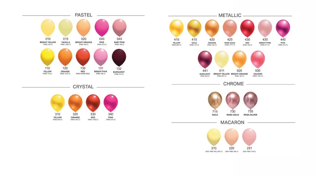
Neutral colours: white and grey
White, grey, beige and other muted shades can provide a neutral base for an arrangement. They work well when decorations are intended to complement the interior rather than compete with it, or when a bolder colour is used only as an accent. If green or earthy tones form part of an event’s visual identity, they can also be incorporated into the decorations. However, a balloon’s colour alone should not be taken as an indication of the product’s environmental characteristics.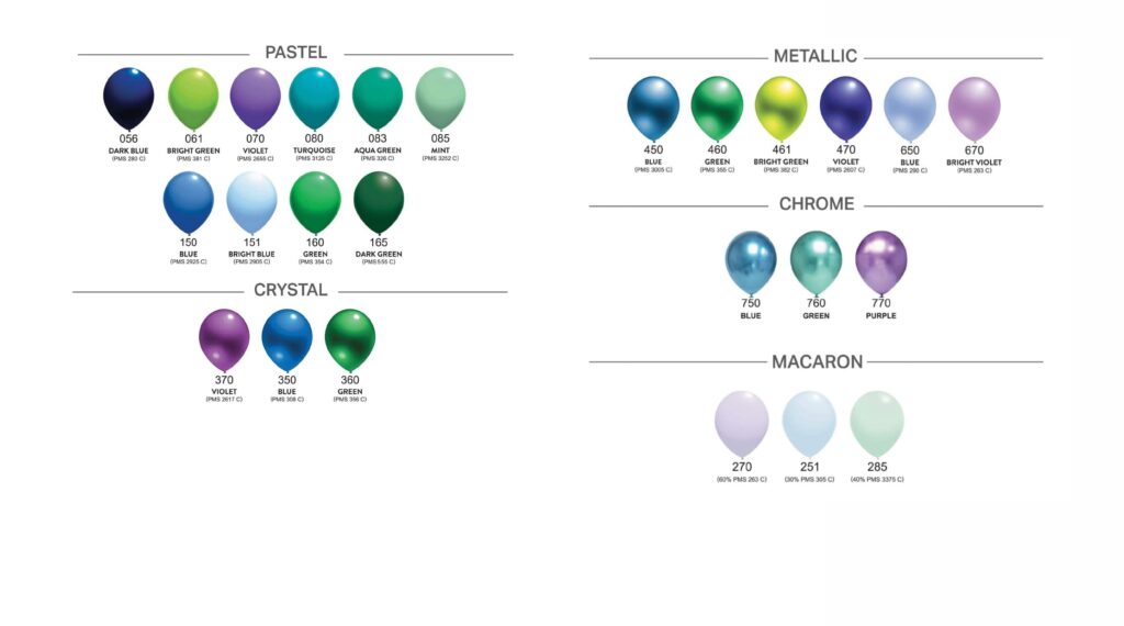
Neutral colours: white and grey
White, grey, beige and other muted shades can provide a neutral base for an arrangement. They work well when decorations are intended to complement the interior rather than compete with it, or when a bolder colour is used only as an accent. If green or earthy tones form part of an event’s visual identity, they can also be incorporated into the decorations. However, a balloon’s colour alone should not be taken as an indication of the product’s environmental characteristics.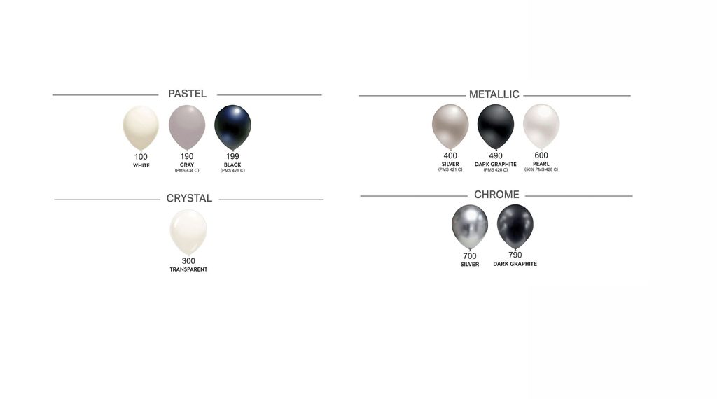
How to match balloon colours to your brand identity
For corporate events, the colours used in your brand’s visual identity are a good starting point. You do not always need to reproduce the entire palette exactly. The main colour can be paired with white, black, silver or another neutral accent to increase contrast and keep the arrangement visually clear. If your brand uses navy blue, Everts-Pol colour 056 can be paired with white, silver or a suitably chosen light-coloured print. Black with a gold accent is another combination we can suggest for arrangements intended to have a darker, contrasting and more formal style. These are design suggestions – how colours are perceived always depends on the overall design and the context of the event.Pastel, Crystal, Metallic and Chrome – how does the finish change the look of a display?
Beyond colour itself, the way a balloon’s surface reflects or transmits light also matters. The finish is therefore another factor to consider when designing an arrangement. Pastel balloons – create a more uniform, opaque surface and can form the base of a larger arrangement. Metallic and Chrome balloons – produce a more noticeable sheen and light reflections, making them suitable as accents under event lighting. Crystal balloons – are more transparent, leaving the background and objects behind them partially visible. They can be used to give an arrangement a visually lighter appearance.Choosing colours for different events – a practical guide
The colour palette should reflect the purpose of the event. As a balloon manufacturer, Everts-Pol recommends the following combinations:| Event type | Suggested palette | Visual character / design objective |
|---|---|---|
| B2B conference | Navy blue (056), Silver (400, 700), White (100) | A subdued, contrasting palette suited to a business event |
| Sales event / promotion | Red (130), Yellow (110), Lime green (061) | A vibrant, highly visible arrangement |
| Gala / anniversary celebration | Pearl (600), Gold (415) | A light base with a metallic accent |
| Environmental event | Dark green (165), Green (160), White (100) | A palette that builds on the colours of the event’s visual identity |
How to avoid colour mistakes at your event
For international events, it is best not to assume that everyone will interpret the same colour in the same way. Colour associations can vary depending on the country, culture and context. For an important international campaign, check the local significance of your chosen colours and how they are used in the brand’s visual identity in that market.FAQ – frequently asked questions
Does balloon colour matter for outdoor decorations?
Colour can affect how radiation is absorbed and reflected, as well as how decorations look in full sunlight. However, a balloon’s resistance to outdoor conditions should not be assessed solely on the basis of its colour. Temperature, exposure time, inflation and installation conditions also matter.
Which colours make a company logo stand out best on balloons?
High contrast provides the greatest readability. When choosing balloon and print colours, aim for a clear contrast. Light-coloured balloons can be paired with a darker print, while darker balloons can be matched with a suitable lighter ink colour. The final choice should take into account the specific design and the chosen printing technology.
Can a balloon’s colour look different after inflation?
Yes. The stretching of the latex, the type of lighting and the background colour can all affect how a shade is perceived. For important projects, assess an inflated balloon under conditions similar to those in which it will be used.